About the Client: Chicagoland Men's Health
Industry: Specialized Men's Healthcare & Wellness
Focus: TRT, hormone optimization, medical weight loss, and ED treatments.
Target Audience: Men in Greater Chicago seeking tailored, physician-led vitality care.
Brand Positioning: Modern, discreet, and clinical wellness care built on personalized treatment plans.
The Challenge
Overcoming patient skepticism around sensitive health topics (TRT, ED, weight management) with discreet, professional branding.
Executing end-to-end designs for time-sensitive email campaigns under strict constraints, frequently turning around final, production-ready assets within an hour.
Translating advanced clinical offerings, such as peptide therapies, NAD+ longevity treatments, and GLP-3 protocols into clear, high-impact visuals.
The Solution
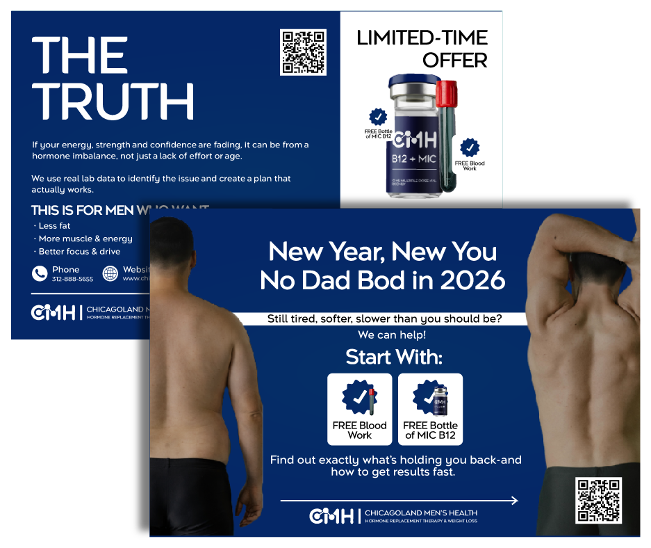
Designed clean, bold email and social media creatives centered around strong headlines to build immediate trust and engagement.
Built an agile workflow to handle tight, high-priority requests-delivering polished, campaign-ready email blasts within 1-hour deadlines.
Translated technical therapies (NAD+ longevity, peptide treatments, GLP-3 weight loss) into clear, visually digestible graphics that drove patient action.

Results & Business Impact
Standardized rapid graphic design workflows, enabling same-day execution and sub-hour delivery for time-sensitive promo email blasts.
Produced high-contrast visual hierarchies and direct-response messaging that significantly improved email open rates and click-throughs.
Demystified specialized treatments (peptide therapies, GLP-3, NAD+) into compelling visual narratives, accelerating patient interest and consultation requests.
Created a seamless digital brand experience across marketing channels, reinforcing client credibility and trust in the local Chicagoland market.
Thought Process & Design Strategy example
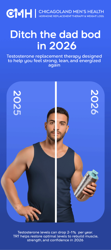
CMH Header Branding (Authority): Positions Chicagoland Men's Health at the top to establish immediate medical credibility and brand recall.
"Ditch the Dad Bod" Headline (Emotional Hook): Bold, high-contrast typography at the top that directly taps into New Year resolution urgency.
Split 2025/2026 Focal Point (Visual Proof): Central split-screen image leveraging a clear before/after line to instantly demonstrate physical transformation and sell the outcome.
Sub-headline & Footer Copy (Validation & Relief): Normalizes age-related testosterone decline with stats, converting body frustration into a valid medical issue with an easy solution.
Electric Blue Canvas (High-Energy Contrast): Bold blue backdrop designed to interrupt feed-scrolling, signaling strength, health, and vitality.
Bonus
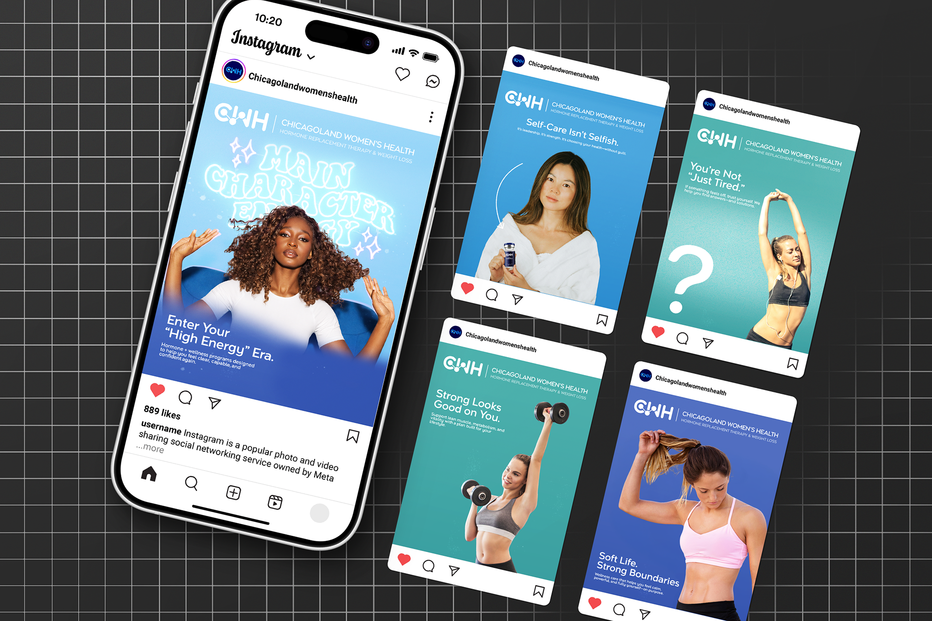
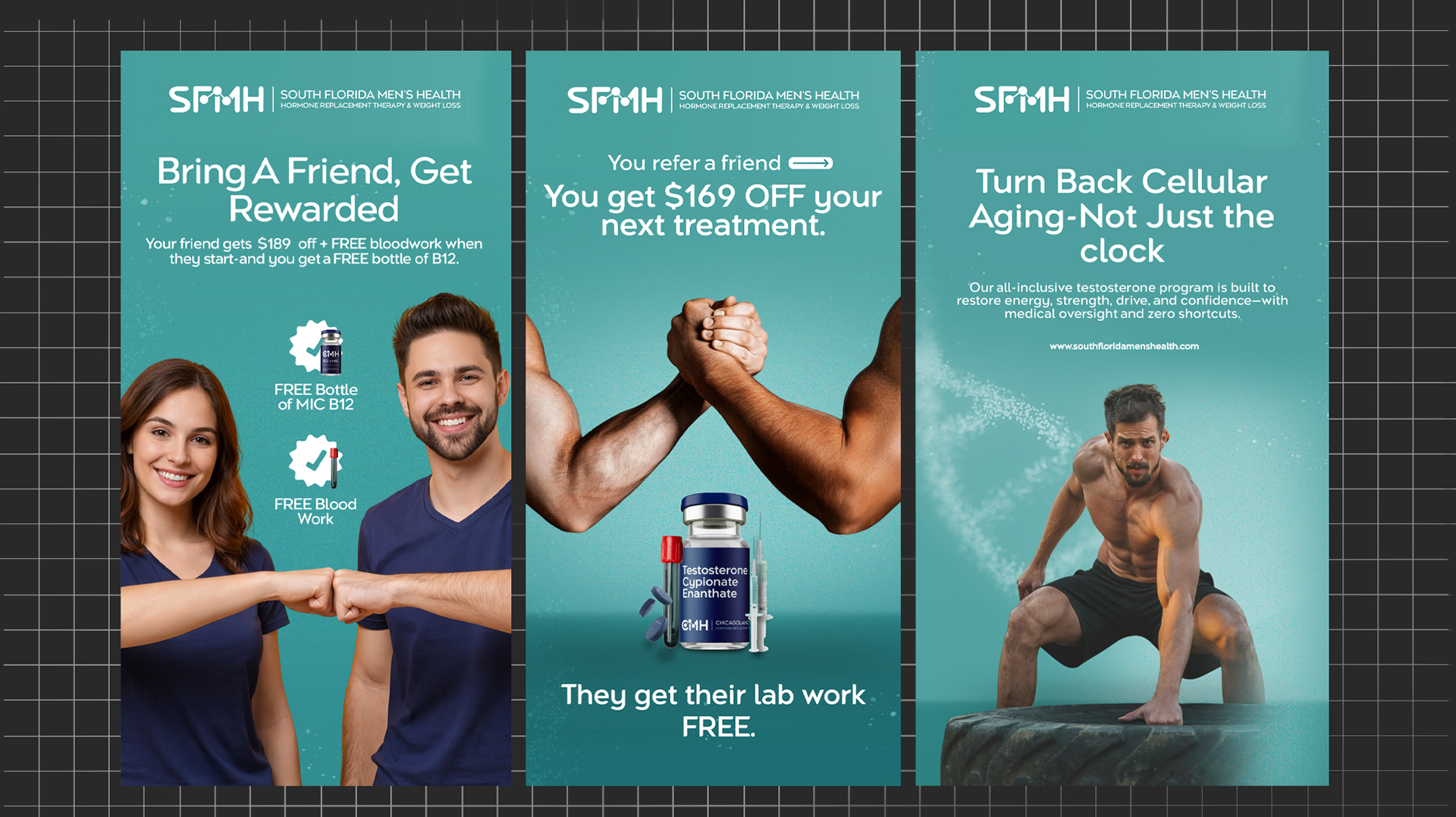
Extended the successful Chicagoland Men’s Health visual system to design tailored marketing collaterals for Chicagoland Women’s Health and South Florida Men’s Health.
Adapted high-converting layout frameworks, color palettes, and typographic tones to resonate with distinct audience profiles and geographic markets without losing brand coherence.